Mobile SEO Secrets
Want to attract a larger audience? Here’s a fun fact: 58 percent of all online searches through Google come from a mobile device.
Basically, your platform needs to be mobile compatible if you want to attract modern audiences.
Ready to get started?
True or False: Mobile Influences Your Overall SERP Ranking
ABSOLUTELY TRUE!
Since 2015, Google’s SERPs have operated with a “mobile-first” mentality. This means that ALL search results are based on the mobile version of the site—even if your consumers are searching on a desktop.
Now, do you understand just how important Mobile SEO is to your long-term success? If you haven’t properly optimized for the smartphone generation, we’re here to give you a head start.
It’s Time to Go Mobile
Mobile SEO Secrets #1: Choose Your Configuration
There are three common ways of creating a mobile variation of your platform:
1. Separate URLs: You can differentiate your content between “canonical” (or desktop) content and mobile content. Your site will intuitively understand what medium consumers are accessing your platform through and direct them to the appropriate URL.
Integrating a separate URL structure isn’t simple:
- On a desktop, you need to add a rel=”alternate” tag point to every mobile URL that matches your canonical content. Without this tag, Google won’t be able to identify your mobile content’s location.
- On mobile pages, you need to add a rel=”canonical” tag to affiliate the mobile content with its original, canonical format.
For example:
Desktop: <link rel= “alternate” media= “only screen and (max-width: 800px)
href= “https://yourwebpage.com/resources”>
Mobile: <link rel= “canonical”
href= “https://yourwebpage.com/resources”>
You’ll have to build these tags into every page your website hosts for them to work effectively.
2. Dynamic Server: A dynamic server hosts your mobile and desktop content on the same URLs. However, each consumer who visits your platform will see different HTML/CSS based on whether he or she is accessing your platform from a phone or a computer.
Thus, for every new piece of content you release, you’ll need to create a mobile version and a canonical version. Once again, you’re taking on a significant amount of work to promote mobile connectivity when another option is available to you.
3. Responsive Design: Responsive design refers to a platform setting that allows your website to respond to users’ viewing medium by shrinking or expanding the content accordingly. Use percentages when coding your CSS to integrate responsive design into your platform. For example:
#body {
width: 75%;
}
With the above code integrated into your platform, your content will appear at 75 percent of its normal size depending upon the method of viewing your consumers are using.
Responsive design is the most straightforward method of mobile configuration for an e-commerce platform. That said, the other two options are still viable—if you want to take the time to integrate them into your site.
Mobile SEO Secrets # 2: Assess Your Page with Fetch as Google
Before you get started assessing your platform’s mobile SEO use and compatibility, view your platform from Google via the Google Search Console tool, “Fetch as Google.”
- 1. Enter a URL from your platform into the prompted box
- 2. Choose “Mobile”
You can now view your site as a consumer would. Doing so serves as an initial site assessment. You can determine here whether certain images or videos aren’t loading, whether headers are getting cut off, and so on.
Mobile SEO Secrets #3: Test for Mobile Compatibility
Now, use your Google Search Console account to determine what your platform’s specific mobility issues may be.
- 1. Type your URL into the tool’s search bar
- 2. Click “Test URL”
- 3. View your usability errors page
Running into problems? Still, losing an audience and not sure why? The most common mobile errors you’ll run into are:
- Slow page load times
- Blocked image files, JavaScript, or CSS
- Unplayable content
- Mobile 404s
- Pop-ups
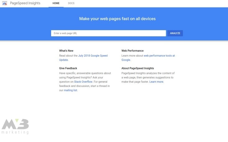
Mobile SEO Secrets #4: Check PageSpeed
Google’s PageSpeed Insights toolkit helps you assess the speed of your site and any elements that may be slowing your loading time.
To use PageSpeed, input your site’s URL into the prompted box.
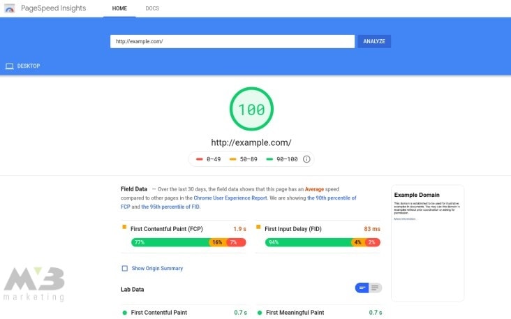
Voila! You’ll see your speed score.
Ideally, your site should hit a score of 80 at a minimum. Scores of 80 and above indicate that your platform will load within two seconds, limiting consumer bounces. Lower scores indicate that your site requires more time to load and that you’re more likely to lose your audience.
PageSpeed outlines the slower elements of your site in red below your overall speed score so you can fix them. The most common problematic elements include:
- Uncompressed images
- Uncompressed HTTP
- Unstructured HTML
You can compress your images and HTTP by removing unnecessary metadata. Utilize tools such as TinyPNG or CompressImage, and you won’t have to worry about deleting any metadata that’s essential to the elements’ structure.
If you operate your platform through WordPress, you can use WP Smush and other plugins, which will compress your images for you.
To compress your HTTP, you need to utilize GZIP compression. Like HTTP and image compression, this process eliminates unnecessary metadata from your platform.
Two examples of HTTP compression include:
- Accept-Encoding: gzip, deflate
- Content-Encoding: gzip
Mobile SEO Secrets # 5: Resize Blocked Files
When your content isn’t appropriately sized, images or architectural elements won’t appear on a mobile browser. To fix this, you can code an auto-adjust into your platform to resize your images and other elements with the mobile screen in mind.
HTML code for image and element resizing reads as follows:
img {
width: auto ;
max-width: 100% ;
height: auto ;
}
You’ll also need to ensure that Google’s crawlers can read your JavaScript or CSS. Google’s URL Inspection Tool will help you better understand how the crawlers read your content. It’ll offer you personalized solutions that’ll help consumers better view your content.
Mobile SEO Secrets #6: Modify Unplayable Content
When your content won’t play in a mobile format, check its standard tags. Flash no longer serves as a primary tag for most online videos. Your videos should instead be HTML5 compatible. You can check this compatibility courtesy of Google Web Designer.

- 1. Create a bank Google Web Designer file
- 2. Choose your format: HTML, CSS, JavaScript, XML, or Google Ads
- 3. Save your file through Google Web Designer to ensure HTML5 compatibility
Mobile SEO Secrets #7: Re-network Mobile 404s
You can use Google’s Search Console to find the missing links and failed redirects that an assessment with PageSpeed reveals.
- 1. Log into your Google Account
- 2. In Google’s Search Console, click the diagnostics tag
- 3. Click “Crawl Errors”
- 4. Click “Not Found”
You’ll need to manually edit any dead links and mobile 404s on your site. Use ctrl+k or your right mouse button to re-affiliate the links.
If one of your desktop pages doesn’t have a mobile parallel, then don’t let mobile users click on it. Instead, redirect users who click on that link to your platform’s home page.
Mobile SEO Secrets #8: Reorganize Your Pop-ups
Pop-ups are useful on a desktop, but on mobile, they crowd consumers’ screens and keep them from your valuable content. To remove or reorganize your pop-ups, you need to use Google Ad Experience Report.
This tool lets you better arrange the location and appearance of your platform’s pop-ups. To use Google’s Ad Experience Report:
- 1. Visit the tool’s home page
- 2. Under “Ad Experience,” select either “Desktop” or “Mobile” to review a report for your site on both platforms
- 3. Upon your site’s review, you’ll receive a rating; “Failing” indicates that your pop-ups need significant reorganization
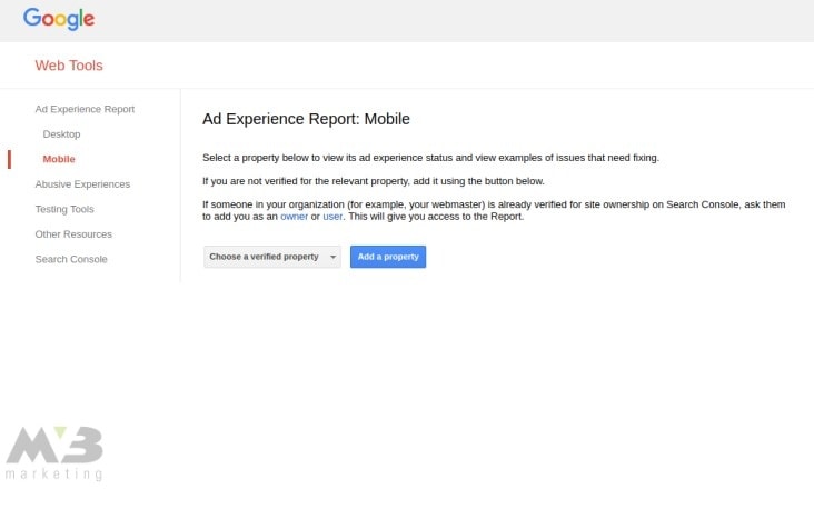
Google Ad Experience Report will explicitly name the ads that are causing your mobile platform to stall in its report. Click on “view examples” in the “what we found” column to find the ads and affiliated page URLs in question.
Creating Mobile-Friendly Content
From the technical elements of mobile SEO, you can move on to the meat of your content.
Mobile SEO Secrets #9: Check for Image Compatibility
You’ve already compressed your images. That doesn’t automatically make them mobile-compatible, though. Once again, the responsive design comes in handy. You can use the following HTML tag to improve the mobile compatibility of your images:
img {
width: auto ;
max-width: 100% ;
height: auto ;
}
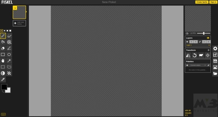
Mobile SEO Secrets# 10: Utilize Sprites
You can use sprites to combine your images. Combining images with sprites allows them to load more readily on mobile.
You can integrate sprites into your platform manually or use an online sprite creator to craft icons and logos.
Piskel and CodeAndWeb are both low-cost or free tools that allow you to make a sprite sheet on your time.
Mobile SEO Secrets # 11: Remove ‘Read More’ Drop-Downs
Google’s mobile crawlers won’t crawl any content that you’ve hidden or blocked from a mobile device. Thus, tucking content behind a “read more” drop-down could lower your SERP ranking.
Keeping the aesthetics and organization of your platform in mind, do what you can to leave SEO-heavy content out in the open on your platform. When you do, you’ll be better utilizing your mobile SEO and improving your SERP ranking.
Step 12: Reduce Your Header Size
Large headers can also run your SEO-rich content off the screen. Reduce your text size to a point that isn’t too small to read but that allows you to keep all your content on a mobile screen. Once again, the responsive design comes in handy here.
Your HTML code won’t be able to reduce your text size, though, only your platform size. You’ll need to check for text run-off with the aforementioned Fetch as Google tool.
Note, too, that your mobile headers should be 78 characters in length, max, to remain on a mobile screen. Your descriptions should come in at 155 words, max, for the same reason.
Number 13: Utilize Negative Space
Don’t overcrowd a consumer’s screen with content. Negative space is essential on a mobile platform. Without it, consumers will accidentally move away from the content they want to see, unintentionally back out of orders, or lose their tempers and bounce from your platform entirely.
Fetch as Google will, once again, help you better understand your platform’s aesthetic. You can maneuver the location of your tabs, buttons, and CTAs based upon the view this tool provides you with.
Number 14: Encourage Social Sharing
Make sure that consumers can share your content on social media. Social share buttons or tab bars allow for quick and easy content sharing across all major social media platforms.
You can integrate a social tab bar into your mobile platform with the help of tools such as Sumo.

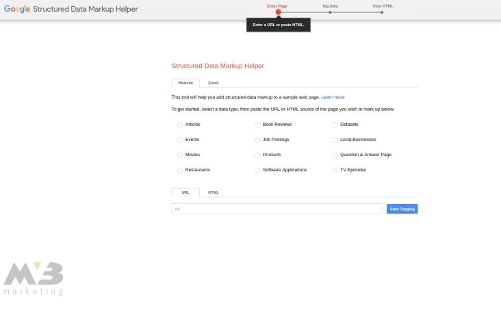
Number 15: Use Schemas to Organize Your Data
You should also organize your platform’s content with schemas so that Google’s crawlers can read it more easily. Google Markup makes schema integration simple:
- 1. Input your content into Google Markup’s interface
- 2. Highlight the section of text you want to optimize
- 3. Markup will provide you with potential schemas to consider
- 4. Once you’ve chosen a schema, click on it
- 5. Upon completion, copy and paste your content into your original platform
Alternatively, you can download marked content from Google Markups.
If you’re using WordPress, the site provides you with a number of plugins that are similar to Google Markups. These include:
Number 16: Ensure that Google Can Read Your Content
You’ll need to check your robot.txt file to ensure that Google can read your content. Mobile SEO is meaningless if Google can’t process the content on your platform.
- 1. Access site.com/robots.txt
- 2. Click “Google Index”
- 3. Click “Blocked Resources”
If your platform has blocked Google’s crawlers, you’ll be able to open your site back up here.
Assessing Mobile SEO Data
After mobile SEO implementation comes assessment. Once you’ve ensured that your platform is mobile compatible and takes advantage of mobile and technical SEO, you can tweak your integrations to improve your platform’s performance.
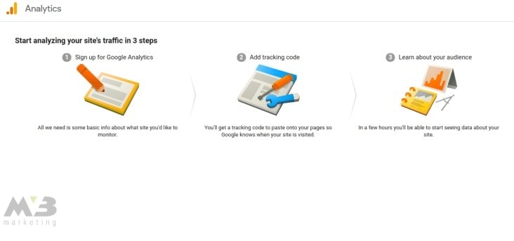
Number 17: Compare Your Desktop and Mobile Analytics
Comparing your mobile analytics to your desktop analytics will let you know whether your mobile SEO is operating as it should. If your desktop analytics outrank your mobile data, then you may not have implemented your SEO elements effectively.
- 1. Log in to Google Analytics
- 2. Click “Site Content”
- 3. View your landing pages
- 4. Identify a page that needs more traffic
- 5. Click “Secondary Dimension”
- 6. Click “Device Category”
Here, you’ll find your data comparison. If your desktop version of your content draws in more traffic than your mobile, you’ll want to ensure that you’re not bumping up against any compatibility issues as listed above.
Alternatively, you can use Google Search Console to access a mobile performance report:
- 1. In Google Search Console, click “+ New”
- 2. Click “Device”
- 3. Choose a mobile view
- 4. Compare desktop statistics to mobile statistics
Mobile Matters. Build Stronger Mobile SEO with MV3
Mobile SEO can be a lot of work—especially if you’re starting from scratch. Want to make sure you do it correctly? Contact the MV3 team.
Our mobile experts are here to comb through every aspect of your site, improving compatibility wherever we go. We know that on-the-go browsing is the way of the future, and it’s time your business got there.
Conclusion
Is your company in need of help? MV3 Marketing Agency has numerous Marketing experts ready to assist you. Contact MV3 Marketing to jump-start your business.
 By: Vance Moore


