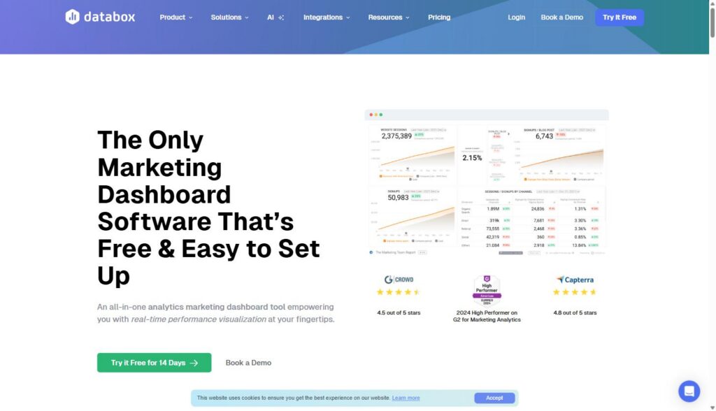
Databox is a business intelligence and reporting platform that pulls data from more than 130 marketing, sales, and revenue tools into one place, then turns it into dashboards, scheduled reports, and plain-English answers. It’s built for marketing leaders, RevOps teams, and agencies who are tired of logging into six different platforms to figure out how the month is actually going.
Disclosure: MV3 Marketing participates in affiliate and partner programs, including Databox’s partner program. Some of the links in this article are affiliate links, which means we may earn a commission if you sign up through them, at no extra cost to you. We only recommend tools we’ve actually researched and would put in front of our own clients.
The Problem With Most Marketing Dashboards
If you run marketing for a B2B SaaS company, you’ve probably built at least one dashboard that looked great in the kickoff meeting and never got opened again. It happens for a predictable reason: the dashboard gets built around what’s easy to pull, not around the three or four numbers a CEO or a board actually wants to see. Then the data goes stale, a UTM parameter breaks, and the whole thing quietly dies in a bookmarks folder.
Meanwhile, the actual reporting workflow at most SaaS companies looks like this: someone logs into Google Analytics, then HubSpot or Salesforce, then Google Ads and LinkedIn Ads, then maybe Stripe for revenue, and manually copies numbers into a spreadsheet or a slide deck every Monday. It’s slow, it’s error-prone, and it means the person doing it spends hours a month on data entry instead of strategy.
This is the specific problem Databox is built to solve, and it’s worth understanding what the tool actually does before deciding whether it fits your team, rather than just taking a vendor’s word for it.
What Databox Actually Is
Databox describes itself as an AI-powered business intelligence and analytics platform, and on its own site it lists more than 20,000 businesses using it to manage performance. The core idea is straightforward: connect your tools, let Databox standardize the metrics, and then either look at a dashboard or ask a question in plain language and get an answer.
The platform is organized around a few core pieces:
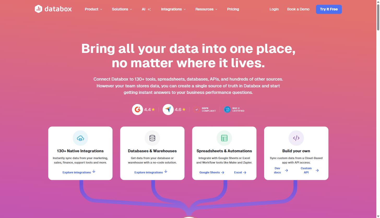
- 130+ integrations covering marketing analytics and automation platforms, CRMs, ad platforms, finance and subscription billing tools, and product analytics, plus the ability to pull custom data from Google Sheets, Excel, or a direct database/warehouse connection.
- Dashboards built from more than 300 prebuilt templates (HubSpot, Google Ads, Google Analytics, Facebook Ads, LinkedIn Company Pages, Google Search Console, and more), or built from scratch with a drag-and-drop designer.
- Genie, an AI analyst that lets anyone on the team ask a performance question in plain English and get an explanation, not just a number, along with the ability to create metrics and dashboards from a prompt.
- Metrics & KPI Builder for standardizing definitions across tools, so “conversion rate” means the same thing in every report instead of six different things depending on who pulled it.
- Goals & OKRs and Forecasts for connecting day-to-day metrics to targets and modeling best- and worst-case scenarios.
- Datasets for filtering, merging, and structuring row-level data before it hits a dashboard.
- MCP support, a newer addition that lets you connect Databox to LLMs and automation tools like Claude, so performance data can feed directly into AI workflows rather than living only inside the dashboard.
Databox itself frames the workflow as six stages: Connect, Prepare, Visualize, Analyze, Report & Automate, and Plan. That’s a genuinely useful way to think about a reporting stack even if you never use the product, because most teams only have the “Visualize” piece (a dashboard) and skip the rest, which is exactly why the dashboard stops being trustworthy after a few months.
If you want to see what this looks like in practice rather than take a marketing page’s word for it, you can start a free trial of Databox here and connect one data source to see how the standardized metrics work before committing to anything.
How Databox Handles Data Reliability and Security
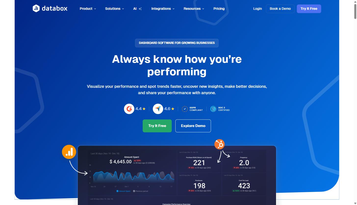
None of this matters if the underlying data can’t be trusted, which is a fair concern for any marketing leader being asked to put a dashboard in front of a CEO or a board. Databox is SOC 2 certified and GDPR compliant, with data encrypted both in transit and at rest and role-based access controls on every account. Integrations are monitored on an ongoing basis, and the platform surfaces an alert when a connection needs attention rather than silently going stale, which is the failure mode that kills most homegrown dashboards. Databox also maintains a public status page where you can check real-time platform and connector availability, which is a reasonable thing to bookmark before you make the tool a dependency for weekly reporting. On review sites, the product currently sits around 4.5 out of 5 on G2, where it’s listed as a High Performer in the Marketing Analytics category, and around 4.8 out of 5 on Capterra, for whatever third-party review scores are worth in a category this crowded.
A Practical Walkthrough: Building a SaaS Marketing Dashboard That Gets Checked Every Week
Here’s a realistic sequence for building a dashboard that survives past the first month, based on how the platform is actually structured.
1. Start from a template, not a blank canvas
Databox ships with templates built specifically for marketing use cases: HubSpot Marketing dashboards, Google Ads performance overviews, website engagement overviews, and combined “Marketing & Sales Deals Overview” dashboards that connect HubSpot Marketing and HubSpot CRM to show both ends of the funnel in one view. Starting from a template forces you to pick metrics someone else has already validated, rather than reinventing a KPI framework from scratch.
2. Connect the sources that actually drive decisions
Resist the urge to connect everything on day one. A typical B2B SaaS marketing dashboard needs, at minimum, a web analytics source (GA4), a CRM or marketing automation platform (HubSpot or Salesforce), and your primary paid channels (Google Ads, LinkedIn Ads). If you’re already deep into your GA4 setup, it’s worth confirming your account structure is clean before you pipe it into any dashboard tool. Our own GA4 audit checklist for B2B teams covers the configuration errors that quietly poison every downstream report, dashboard tools included.
3. Standardize your metrics before you visualize anything
This is the step most teams skip. Databox’s Metrics & KPI Builder lets you define what “MQL,” “pipeline,” or “signup” means once, with the filters and calculations baked in, so every dashboard and report pulls from the same definition. If you’re unclear on how terms like MQL, SQL, or CAC payback period are typically defined in a B2B context, our marketing glossary is a reasonable starting point before you lock in definitions internally.
4. Set goals against the metrics that matter
Once metrics are standardized, Goals & OKRs let you attach a target to each one and track progress in real time instead of finding out you missed pipeline targets on the last day of the quarter. This is also where the tool starts to separate itself from a plain dashboard: a chart that just shows “signups this month” is informational, but a chart that shows signups against a goal, with pace, is actionable.
5. Automate the report, don’t manually rebuild it
Reports combine live metrics, visualizations, and written commentary on a schedule, so the Monday-morning ritual of copying numbers into a slide deck goes away. For agencies, this is usually the single biggest time saver, since it replaces the manual client-report-building process entirely.
6. Let Genie answer the follow-up questions
The part of reporting that dashboards have always been bad at is the follow-up question: “why did this drop?” Genie is built specifically for that, letting anyone ask a plain-language question about the connected data and get an explanation rather than having to build a new chart to investigate.
Real Use Cases for SaaS Marketing and Agency Teams
The most useful way to evaluate a reporting tool is to look at how real teams actually use it, not just the feature list.
In-house SaaS marketing teams generally use Databox to unify GA4, paid channels, and CRM data into one weekly view for leadership, with Goals tracking pipeline and signup targets and Forecasts modeling whether the team is on pace for the quarter. Because unlimited users are included on the Pro, Growth, and Custom plans, marketing, sales, and finance can all look at the same numbers without per-seat costs piling up as the team grows.
Agencies tend to use it differently: as a client reporting tool, a retention tool, and occasionally as part of the sales process with new prospects. Databox’s own published case study on Agent 6 Marketing, a digital marketing agency, is a good illustration of the pattern. According to that case study, Agent 6 was capped at 25 clients in early 2020 partly because manual reporting was consuming too much team bandwidth. After switching to Databox and connecting sources like Google Analytics, Google Ads, Facebook Ads, and Google My Business, the agency’s director reported the switch saved roughly a quarter of some team members’ time on reporting, and the agency doubled its client base to 50 within about a year. That’s one agency’s specific result, not a guarantee, but it’s a concrete, named example rather than an abstract claim.
Executive and board reporting is another common use case. Combining Goals & OKRs with Forecasts lets a marketing leader walk into a board meeting with a dashboard that shows not just “here’s what happened” but “here’s whether we’re on pace, and here’s the range of outcomes we’re modeling for next quarter.”
If any of those use cases sound close to your own reporting headaches, you can try Databox free here and connect your GA4 and CRM data to see how your own numbers look standardized in one place before you decide whether to pay for anything.
What Databox Actually Costs
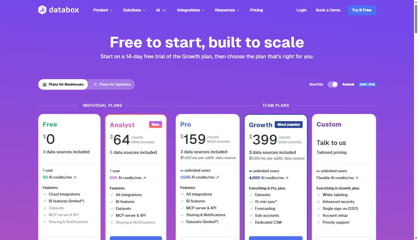
Pricing is one area where it’s worth going straight to the source rather than trusting a comparison site, since these figures change. As of this writing, Databox runs two separate pricing tracks: plans for individual businesses and a separate set of plans for agencies managing multiple client accounts. All prices below are the monthly rate when billed annually.
Plans for businesses
| Plan | Price/mo (billed annually) | Data sources | Users | Notable features |
|---|---|---|---|---|
| Free | $0 | 3 | 1 | Cloud integrations, limited BI features |
| Analyst | $64 | 5 | 1 | All integrations, BI features, Datasets, MCP & API |
| Pro | $159 | 3 (+$5.60/mo per extra) | Unlimited | All integrations, BI features, MCP & API, limited Datasets |
| Growth | $399 | 3 (+$5.60/mo per extra) | Unlimited | Everything in Pro, plus Datasets, faster sync, Forecasting, sub-accounts, dedicated CSM |
| Custom | Talk to sales | Flexible | Unlimited | Everything in Growth, plus white-labeling, SSO, priority support |
Plans for agencies
| Plan | Price/mo (billed annually) | Data sources | Client accounts | Notable features |
|---|---|---|---|---|
| Agency Starter | $79 | 3 (+$2.40/mo per extra) | 5 | Cloud integrations, limited BI, MCP & API |
| Agency Pro | $159 | 3 (+$2.40/mo per extra) | Unlimited | All integrations, BI features, limited Datasets |
| Agency Growth | $399 | 3 (+$2.40/mo per extra) | Unlimited | Everything in Pro, plus Datasets, faster sync, Forecasting, sub-accounts, dedicated CSM |
| Agency Premium | $799 | 50 included | Unlimited | Everything in Growth, plus white-labeling, SSO, priority support |
Both tracks currently include a 14-day free trial of the Growth-tier plan, with no credit card required to start, and a permanently free plan for anyone who only needs three data sources and a single user. For most in-house B2B SaaS marketing teams, Pro or Growth is the realistic tier once you need more than one person looking at the dashboard. For agencies, the jump from Agency Starter to Agency Pro is really about unlimited client accounts, which matters the moment you pass five clients.
It’s worth noting the additional-data-source pricing is meaningfully cheaper on the agency plans ($2.40/mo per extra source vs. $5.60/mo on the business plans), which reflects that agencies typically need many more connections across client accounts.
Databox vs. Building It Yourself
The honest alternative to a tool like Databox isn’t usually a competing paid platform, it’s building reports manually in spreadsheets or a free tool like Looker Studio. Both are legitimate options, and it’s worth being clear-eyed about the tradeoff rather than pretending there isn’t one.
Building dashboards manually in Looker Studio or spreadsheets costs nothing in subscription fees, and for a single, simple report on one or two data sources, it can be entirely sufficient. Where it tends to break down is at scale: every new integration is another connector to maintain, every metric definition has to be manually kept consistent across every report, and the person who built the original spreadsheet often becomes the single point of failure when they’re out sick or leave the company.
Databox’s own positioning on this, laid out on its pricing FAQ, is that traditional BI and in-house builds carry three costs teams tend to underestimate: per-seat licensing, the engineering time to build and maintain data pipelines, and the ongoing analyst time required to keep dashboards current. Whether that tradeoff is worth a few hundred dollars a month depends entirely on how many hours your team is currently spending on manual reporting, and how many people need reliable access to the numbers. If it’s one person checking GA4 once a week, you probably don’t need a platform. If it’s marketing, sales, and finance all needing a shared, trustworthy view every week, the math usually flips in favor of a dedicated tool.
Databox also publishes direct comparison pages against several alternatives, including Looker Studio, Tableau, Power BI, and agency-focused tools like AgencyAnalytics and Whatagraph, if you want a vendor’s own framing of where it differs from each.
A Realistic First-Week Setup Checklist
If you decide to test it, here’s a scope that’s achievable in a single week rather than turning into a quarter-long project:
- Day 1: Connect GA4 and one CRM or marketing automation platform. Don’t connect everything at once, since it makes the first dashboard harder to reason about.
- Day 2: Start from the closest matching template rather than a blank dashboard, and swap in your own metrics one panel at a time.
- Day 3: Use the Metrics & KPI Builder to define your two or three most-argued-about metrics once, so nobody has a different answer for what counts as a qualified lead.
- Day 4: Set one goal against your primary pipeline or signup metric so the dashboard shows pace, not just a raw number.
- Day 5: Schedule one automated report to the people who actually need it, then delete the version of this report you were building manually before.
That scope is intentionally narrow. The dashboards that get abandoned are almost always the ones that tried to show everything to everyone on day one instead of proving value on one team’s most important number first.
Is Databox Right for Your Team?
Databox makes the most sense for teams that already have data scattered across multiple platforms and are spending real hours each month manually assembling reports. It’s a strong fit for B2B SaaS marketing teams that need one shared source of truth across GA4, CRM, and paid channels, and for agencies that need to produce polished, consistent client reports without rebuilding them from scratch every month.
It’s a weaker fit if you only have one or two data sources and one person looking at the numbers, since a free GA4 dashboard or a simple spreadsheet will do the job without adding another subscription. It’s also not a replacement for a data warehouse if your team needs deep, custom SQL-level modeling across years of historical data at scale, though the Datasets feature covers a meaningful amount of that middle ground for most marketing teams.
If your reporting stack currently lives across six browser tabs and a Friday-afternoon spreadsheet ritual, that’s usually the clearest sign it’s worth testing. You can start a free Databox trial here and connect your actual GA4 and CRM data to see whether the standardized view is worth paying for, before you commit to a paid plan.
Share this article

Alex Carter leads SEO and content strategy at MV3 Marketing, specializing in generative engine optimization, technical SEO, and AI-driven content systems for B2B SaaS companies.
Ready to audit your organic growth opportunity?
$2,500 flat. 5 business days. Six deliverables tied to pipeline , not rankings. No retainer required.
Get the Organic Growth Audit →