How to leverage Mobile SEO to Grow Your Business

If you have yet to implement a mobile SEO strategy, then you’re losing customers and sales. More than ever, mobile phones have become the key to improving your ability to be found by the people that need your business. Search engine optimization (SEO) is, of course, multi-faceted and covers a variety of different types; however, mobile SEO is being overlooked by businesses who are instead focusing on technical, desktop, or content SEO. Now that Google rewards those websites that have been optimized for mobile viewing, it’s more important than ever that your business prioritizes mobile SEO like never before.

It’s not enough to use standard SEO techniques. Many of those techniques are fantastic for desktop or laptop users but have limited value for mobile SEO. As more people than ever are using their phones to browse, buy, and learn online, mobile SEO is critical.

Leverage Mobile SEO to Grow Your Business

Why is Mobile SEO Important?

Google (and other search engines) make changes to their algorithms regularly, and that means you need to keep updating your SEO strategies to adapt to those changes. Failing to do so can mean that you can become almost invisible online, and potential customers will not be able to find you when they need you. Mobile SEO is vital because:

  • Popularity: More people are using their mobile devices (phones and tablets) to get answers than they are using desktop computers. This has been a steady rise, and it’s only going to continue.
  • Mobile-First: Google has changed to what they called ‘mobile-first indexing’. What this means is that they will put a higher value on those websites that have been designed to be more usable on mobile devices. The content on your pages will help you rank more highly on search engine results pages (SERPs) if that content can be easily read, and your website is easy to navigate on touchscreen devices.
  • Sales: Before modern consumers buy a product or service, they are doing their research. Nobody likes wasting money, and from buying a new toothbrush to investing in a new property, people are watching video reviews and reading content reviews on their devices more than ever. Not only are they finding out more about the products they want, but they are also completing those sales on the same device. Creating a seamless sales funnel that is usable on a phone or tablet is essential for your sales figures.
  • Voice Search: The rise of smart assistants on phones and smart speakers has seen continued growth in voice searches. Many businesses are yet to optimize their websites, and their SEO for voice search, which means doing so can immediately put you ahead of your competition. Since most modern smartphones and devices have voice search capability, optimizing for this is crucial to future-proof your business.

Failing to adopt the best mobile SEO practices in the age of the smartphone is a mistake that most businesses simply can’t afford to make. If you want your business to grow, then you need a clear idea of how much demand there is for mobile perfection for your specific company.

Determining Mobile SEO Value for You

While almost every business will benefit from a more proactive approach to mobile SEO, your first step is to check exactly how much traffic your website receives from mobile device users. This is very easy to do. Simply head to Google Analytics and navigate through to the ‘Audience’ section. Click on ‘Mobile,’ and you will get a detailed breakdown of the devices used to visit your website. However, don’t simply look at those percentages and move on. Have a look at those data sets by date (click on the ‘onscreen date selector’) and have a look at how much your mobile traffic has grown. There’s a very strong likelihood that those stats show growing numbers, highlighting the importance of taking a more thorough approach to mobile SEO.

Is Your Website Mobile-Friendly?

If you’re planning to improve your mobile SEO, then you need to know exactly where you stand right now. That means knowing what your website currently looks like when viewed on multiple types of devices. Fortunately, Google has created a tool specifically for this with its mobile-friendly test page. All you have to do is type in your URL (remember to do this for every page on your site), and you’ll receive a detailed report letting you know how friendly your site is for mobile device users. Your next step is to ensure that your site is crawl friendly. When you create a website, search engines methodically work their way through your pages and your content (known as crawling) so that they can index you accordingly. If your website isn’t crawlable, then you won’t show up on SERPs. Again, Google wants this to be easy, so you can use the Google Search Console to check for crawl errors, specifically when viewed through a smartphone.

Use Mobile SEO to Make Your Website Mobile Friendly

Google isn’t the only search engine available, but with the largest share of the market and the fact that most search engines work in the same way, using Google’s available testing tools is simply smart. However, there is a huge range of online tools and resources available that can also be used to check the mobile-friendliness and crawlability of your web pages.

Improving the User Experience

Mobile SEO is noticeably more affected by the user experience than other forms of search engine optimization. That’s because the bounce rate is significantly higher with mobile users than those on PCs and laptops. Bounce rate is a factor that search engines will rank you for, and if your bounce rate is too high, then Google will consider that your site is not providing users with the experience they’re looking for.

The bounce rate is when a website visitor lands on your pages and then leaves quickly. Your bounce rate will be worse if that user takes no further actions on your pages, such as clicking on a link or another page. The goal should be to have a high ‘dwell time’, which is the amount of time that someone spends on your website after finding it. You can do this by making sure that you have:

  • Fast loading times: If your website takes more than a few seconds to load, then people are just going to bounce. If it takes longer than two seconds to load, then you can lose up to 47% of your site visitors. Take longer than three seconds, and you lose another 40%. Use the Google mobile speed test to find out exactly how long it takes your website to load on a mobile device, if it takes too long then you’re going to need to speed up your website. There are many in-depth guides on how to do this, but the basic steps include –
  • Using an image compressor to reduce the size of your photos, with larger images slowing down your entire site’s loading time
  • Use caching so that you can deliver your pages more quickly
  • Get into the coding and combine code where you can
  • Switching to a better website hosting platform
  • Responsiveness: This is at the core of your mobile SEO and the experience of your website visitors. A responsive website is one that changes layout and design elements depending on the type of device it is being viewed on. The goal is to create a better browsing and visual experience (you have probably used your phone to visit a non-responsive website and seen the immediate issues). Making sure that your website is responsive to device-use can be a very quick and easy task, and yet so many websites remain stuck on desktop view only. Hosting platforms like Wix and WordPress have themes that you can add for improved responsiveness, and on some platforms, it’s as easy as turning on ‘responsive’ in the settings.
  • Seamless Consistency: The importance of consistency in terms of branding is the subject of much online discussion. What is less discussed is the need for website consistency from device to device. In the digital and mobile world, consumers jump from phone to tablet to laptop throughout the day and can visit a website on multiple devices over a very short time. Branding consistency is vital, but so is functionality. If your website has more limited features (such as fewer ways to pay, unavailable content, etc.) on a specific device, then those consumers will be far more likely to head to a website that is consistent on all of the devices that they want to use.
  • Pop-Up Ads: Adverts and promotional banners can be critical for your sales funnel, but they can also be a significant problem for mobile users. An immediate pop-up ad that prevents the user from being able to see the content will only add to your bounce rate, affecting your SERP rankings immediately. Those pop-ups might be great for your conversion rates on laptops, but on mobile, they are just in the way. Ideally, you should remove those adverts and use alternative calls-to-action that will convert instead. Google will now punish those websites that have the following advert issues:
  • Pop-ups that cover the main content of the page
  • Interstitial ads that show up after a few seconds of looking at a page, especially if that ad blocks out the content
  • Having the main content ‘below-the-fold’ with an advert ‘above-the-fold’

However, some pop-ups are tolerated by Google:

  • Age verification interstitials and cookie-warning notices are acceptable
  • Easily dismissible pop-ups that take up little space on the screen and can be easily removed

Remember, too, that many mobile device users have installed ad-blockers on their phones and tablets, so not only will they not even see those pop-ups, they will also be slowing down your website by valuable seconds. You need to evaluate the value of those adverts, and in many cases, get rid of them entirely and look at alternative design choices.

Mobile SEO and the Optimization Basics

There are some areas of mobile SEO that will be consistent with the rest of your SEO options. There are many guides available on these types of SEO essentials, and the basics will largely be the same. For improved mobile SEO, you need to adopt these practices and keep up to date with them. Make sure that your website has made use of the following:

  • Content Optimization
  • Appealing headlines
  • Keyword research and use
  • Inbound links to aid user navigation
  • Long and short-form content that has value

However, there are differences between mobile SEO and other types of optimization.

Keyword Research and Mobile SEO

While Google and other search engines state that they don’t use social media as a ranking factor, the fact is that there are a lot of indications that it does play a part. It seems that a strong presence on social media results in a higher ranking on SERPs. Even without that suggestion, it’s clear that there is a link between mobile SEO and social platforms, not least because of the simple fact that about 80% of all social media browsing is performed on a mobile device. To improve the link between your social presence and your website, make sure that you make your content as easy to share as possible.

Keyword Research for Mobile SEO

If someone reads your latest blog post on their phone and it takes more than a few seconds for them to work out how to share it, then there’s a higher chance that they will just not bother. Don’t forget that social sharing buttons don’t just have to be Facebook, Twitter, or Reddit. Make sure that there are options for sharing to messaging platforms like WhatsApp and Signal.
Preparing for Voice Search

There are some incredibly sobering statistics available when you start looking at the rise in online voice searches. The fact is that search queries are changing, and voice search is quickly outgrowing typed searches. That means a shift in thinking is essential. People ask questions very differently with their voice than when they type into a search engine, and as more households get smart assistants, those spoken Google searches are only going to become the norm.

Preparing for Voice Search

Once again, Google has created a search quality rating guide that can help you make sure that your website is more easily found when someone asks the relevant questions. The basics of those guidelines are:

Advertisements
  • Using content that answers specific questions
  • Providing answers to those questions in the most immediate and succinct way
  • Having the right answers

This will come down to your content strategy, which has to be updated in the age of both mobile browsing and voice search. Use your questions as a subheading and make more use of lists and bullet-points in your content. You will also need to have another look at your keywords and start adapting your content so that it includes more long-tail keywords.

Long-tail keywords are more important than ever, thanks to voice search. These are keywords that can be entire sentences related to your industry and business and will tend to be in the form of a question. Long-tail keyword research is vital.

Local and Mobile SEO

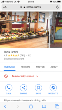
Local SEO is a whole new subject entirely, but when users are more likely to be performing local searches that informational searches on their mobile devices, it’s worth going over the basics to ensure that your website is ready for that increase in potential local traffic. If you want local customers to be able to find you, then you need to:

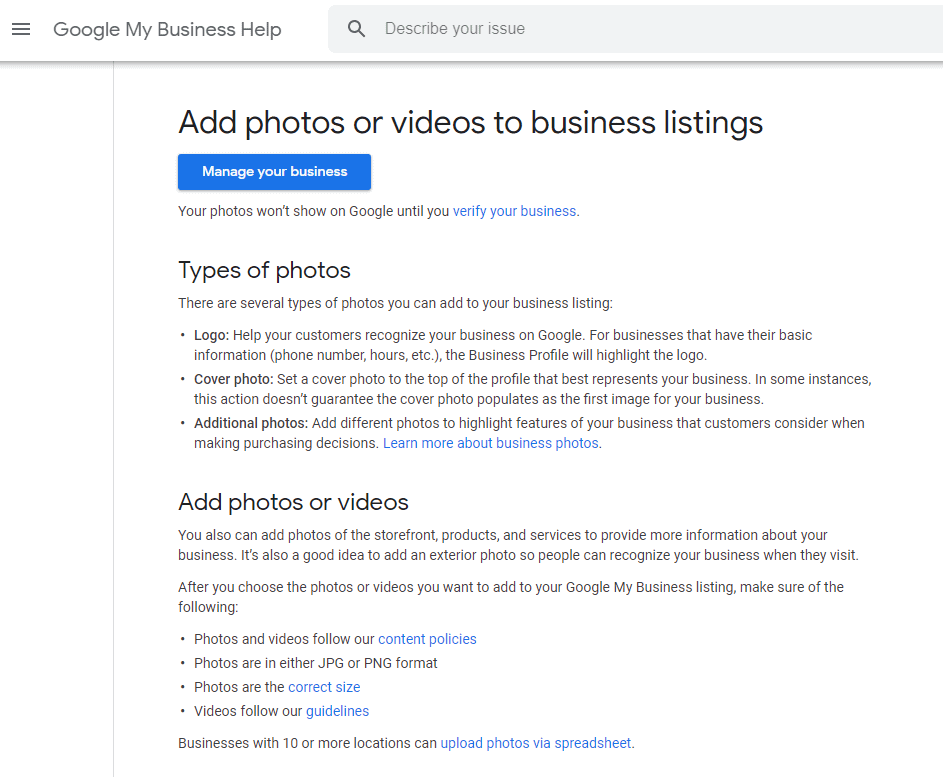
Add photos or videos to business listing
  • Create relevant local content
  • Use your local keywords on your pages, in your content, and on your social platforms
  • Have a presence on local business directories, such as GMB. The more images and information you provide, the better.
Mobile SEO and Snippets
  • Engage with local reviews

With local searches taking up such a large part of mobile browsing, it is simply good business sense to ensure that your local SEO and your mobile SEO are working collaboratively.

Mobile SEO and Content

It’s not enough to turn on your ‘responsiveness’ settings on WordPress and consider that your website is now perfect for mobile browsing. More than ever, you have to adjust your thinking and start thinking mobile-first. After all, that’s what Google is doing. Nowhere is this more important than in your content. Now, content SEO is another one of those huge subjects that can take time to learn and perfect. However, there are some clear actions to take that will not only improve the mobile browsing experience of your site visitors but can also be the key to creating a content strategy that won’t run out of steam.

  • Page layout: People read their smaller screens differently than their laptop screens and PC monitors. On larger screens, the eye tends to travel in an F pattern, starting at the top left and moving right before dropping down. It’s just like reading a book. On a phone or tablet, the eye will tend to focus on the top-center of the screen first, and then follow where your content takes them. So, a minor change like centering all of your headlines can have an immediate effect on bounce rates because those site visitors will see your headline and know immediately whether or not they are in the right place.
  • Content breakdowns: More significant for mobile viewing is the layout and structure of your content. The goal is to provide a pyramid-type structure that provides viewers with what is called the Bite, Snack, Meal approach. Your content will then have three elements that will each satisfy different types of site visitors.
  • Bite: This is the headline and should serve as a hook that will grab the attention of your reader. Your headline needs to be clear and precise so that those readers know exactly what they’ll be getting if they continue to read. Don’t use clickbait headlines that leave the reader guessing.
  • Snack: This is a basic summary of the entire content, and for many readers, this will be all that they need to know about that content. A good way of thinking of this intro is that it could just as easily be used as the conclusion of your content because it summarizes everything that the reader will learn.
  • Meal: This is the bulk of the content where you go into as much depth as you like. This is the content that many site visitors will be coming to you for, whether it’s a product page, user-guide, or industry-relevant blog post.

Don’t forget that reading a large chunk of text on a smartphone isn’t appealing at all, so always use paragraphs, line breaks, and sub headers. Those sub headers also make it easier for search engines to identify what your content is about, which helps them to rank you correctly.

  • Mixed Length Content: If you’ve seen any tips on creating content, you’ll see that there is constant debate about the ‘perfect’ word count. The fact is that there is no such thing as the perfect word count, and you should instead focus on creating content that is of mixed lengths. Long-form content of 2000+ words will attract a specific audience and will be great for your SEO, while shorter, bite-sized posts are great for sharing and for providing immediate answers. Use a combination, and your mobile SEO will grow more effectively in a more organic way.

Video Content and Mobile SEO

Video marketing is more important and valuable than ever, especially when it comes to SEO. Videos are shared more, watched more, and have a higher level of ROI than other forms of content. When a billion hours of video are watched every single day on YouTube alone, that’s a huge audience to take advantage of. However, video content is not without its risks, especially for mobile SEO. The first problem is that video can dramatically slow down your page loading time, adding to the risk of a high bounce rate. You can also find that an embedded video is not playable on every device or that (for global brands), some videos are limited by country. If a site visitor can’t watch your video, then they’re not going to hang about!

Video Content and Mobile SEO

To tackle these potential problems, avoid using a default video player, and get your website manager to talk to you about HTML5 standard tags. Additionally, it’s often worth adding a transcript of your video beneath the embedded player. Not only will this help search engines to index that content, but it also means that site visitors who prefer to read anyway will have the option and will stick around for longer.

A Word About Flash

Adobe Flash is something that you should get rid of across your entire online footprint. If your website is still using Flash, then you’ve got digital real estate that mobile users just can’t see. That means it’s taking up valuable space unnecessarily. The iPhone has never supported Flash, and even Android phones now restrict its visibility due to battery draining issues. Make the decision now to get rid of all Flash content on your site.

Mobile SEO and Snippets

There’s a good chance that you’ve seen snippets every time that you do an online search. They are the single search result that you get before you see the listed ads and organic SERP rankings and tend to consist of the page title, the URL, and a description of the content. In most cases, the snippet will be the quick answer to whatever question the search engine was asked. Snippets are attention-grabbing (and are usually what a voice search will respond with when you ask a direct question), and they can lead to a considerable rise in website traffic. If you’re working on improving your mobile SEO, always keep up to date with the featured snippets that are relevant to your content and industry. If your competitors are the snippet for a search query that you want to stand out for, then you know you need to do some work if you want to get more user attention.

how to paint your house
  • Opening paragraphs of 40-60 words will be more likely to feature as a snippet (around 350 characters) in the form of a block of text
  • Snippet lists mean creating listicle content, which should always have more than eight items listed so that if readers want to see more, they have to go to your website

As voice search rapidly becomes the de facto way to do an online search, snippets are only going to grow in importance. Put simply, if you don’t appear as a snippet with a voice query, then you might as well be invisible on SERPs entirely.

The Technical Side of Mobile SEO

When it comes down to the technical side of things, there are many similarities between mobile SEO and desktop SEO. The same elements need to be present, including:

  • Title tags
  • H1 and H2 headings
  • Image alt text
  • Meta descriptions

For mobile SEO, you need to pay a little more attention to your meta descriptions and title tags because there isn’t as much space on a mobile screen, so these need to be shorter than usual. Keep those titles short! You should also take care not to block JavaScript and CSS, which is very different than it used to be. Previously, blocking both was standard practice because they slowed downloading speeds, but blocking them now means that search engines won’t be able to see your pages at all. Don’t forget as well that schema markup (adding relevant tags and metadata to your HTML) is just as crucial for mobile SEO as it is for desktop SEO, so don’t ignore it.

Mobile Forms

There’s a good chance that you want your website viewers to give you some information at some point, whether they buy from you or not. Sometimes, this is signing up to an email newsletter, or for asking a question that they can’t find an answer to on your pages. You need to ensure that those forms are easy to fill out, which can be tricky considering the size of our fingers compared to the size of a smartphone keyboard! It’s easy to overlook this seemingly minor ingredient of website design, but it can make all the difference when it comes to keeping someone invested in your brand. Not only do your forms need to fit comfortably on the smaller screen, but they also need to be large enough to use. Fields need to be large enough to click on, and your keyboard choice is going to be a vital component to get right. Even small changes, like only having number options for phone number details, can make a huge difference to the user experience.

Never try using a smaller font just so that you can try and squeeze in a bit more content onto a screen. This will make the form harder to read and will be more likely to just frustrate the user.

A Quick Note on Apps

Having a dedicated app is great for SEO, but not every business will need to go through the process of designing one and having it approved for an app store. Of course, an app opens a whole new potential for improved user experience, but if your customers aren’t likely to download and use it then it’s going to be a waste of time. This will depend on your audience size and growth strategy. You will also have to factor in privacy concerns, which can turn the whole development of an app into a headache that is not going to give you the ROI that you hope for.

A Quick Note on Apps

More important than ever, mobile SEO is going to be the key to the growth of almost every business model with an online presence. If you want your business to have a higher level of online visibility, more traffic coming to your web pages, and more chances to outperform your competitors, then mobile SEO is the solution. Take your time to get your mobile SEO right, and your growth goals will be far easier to achieve.